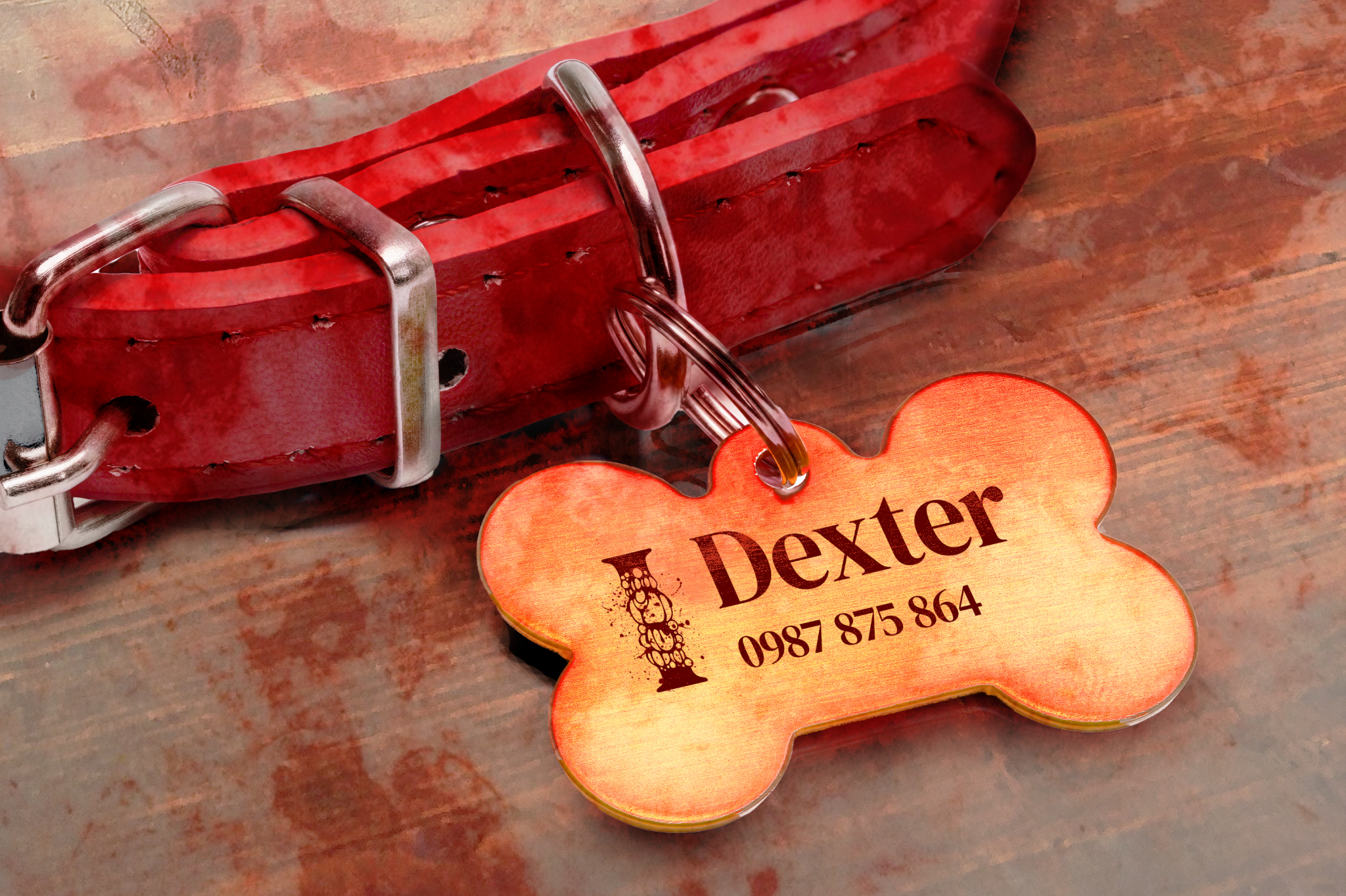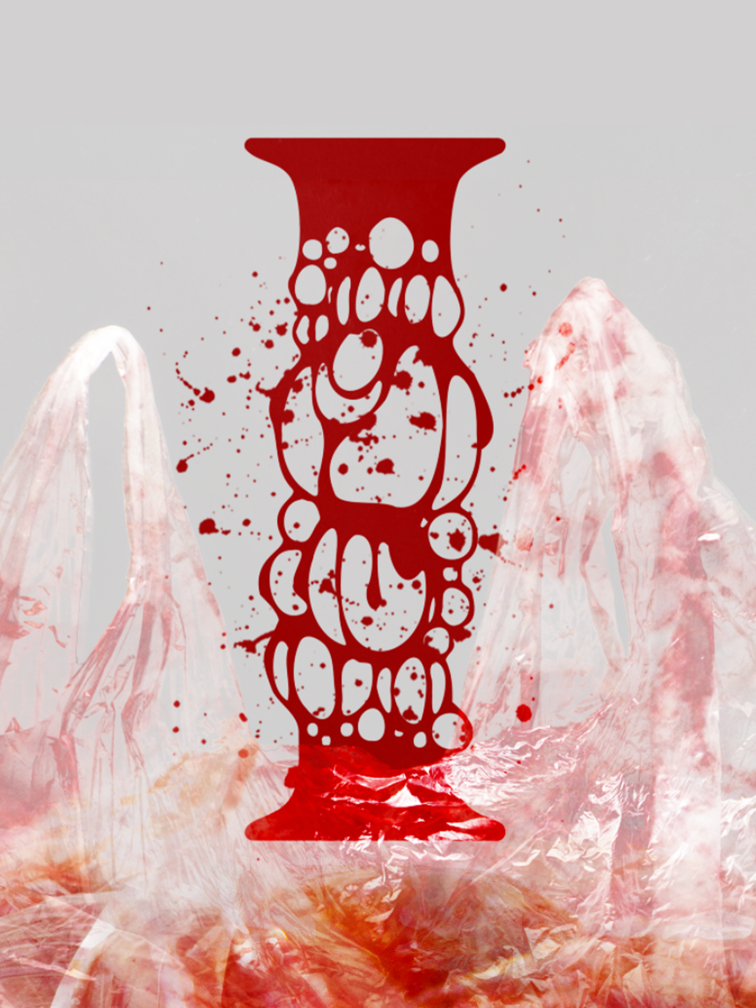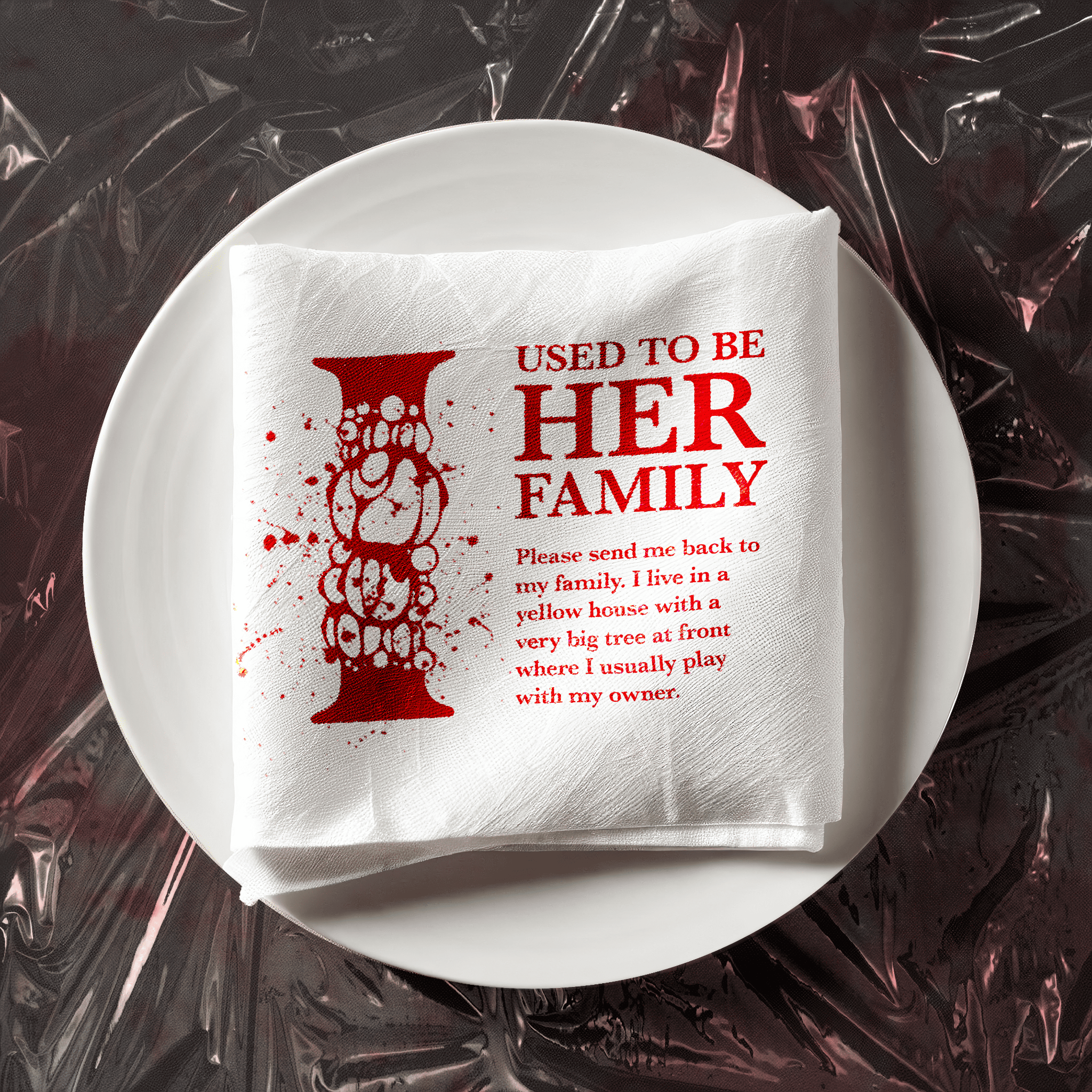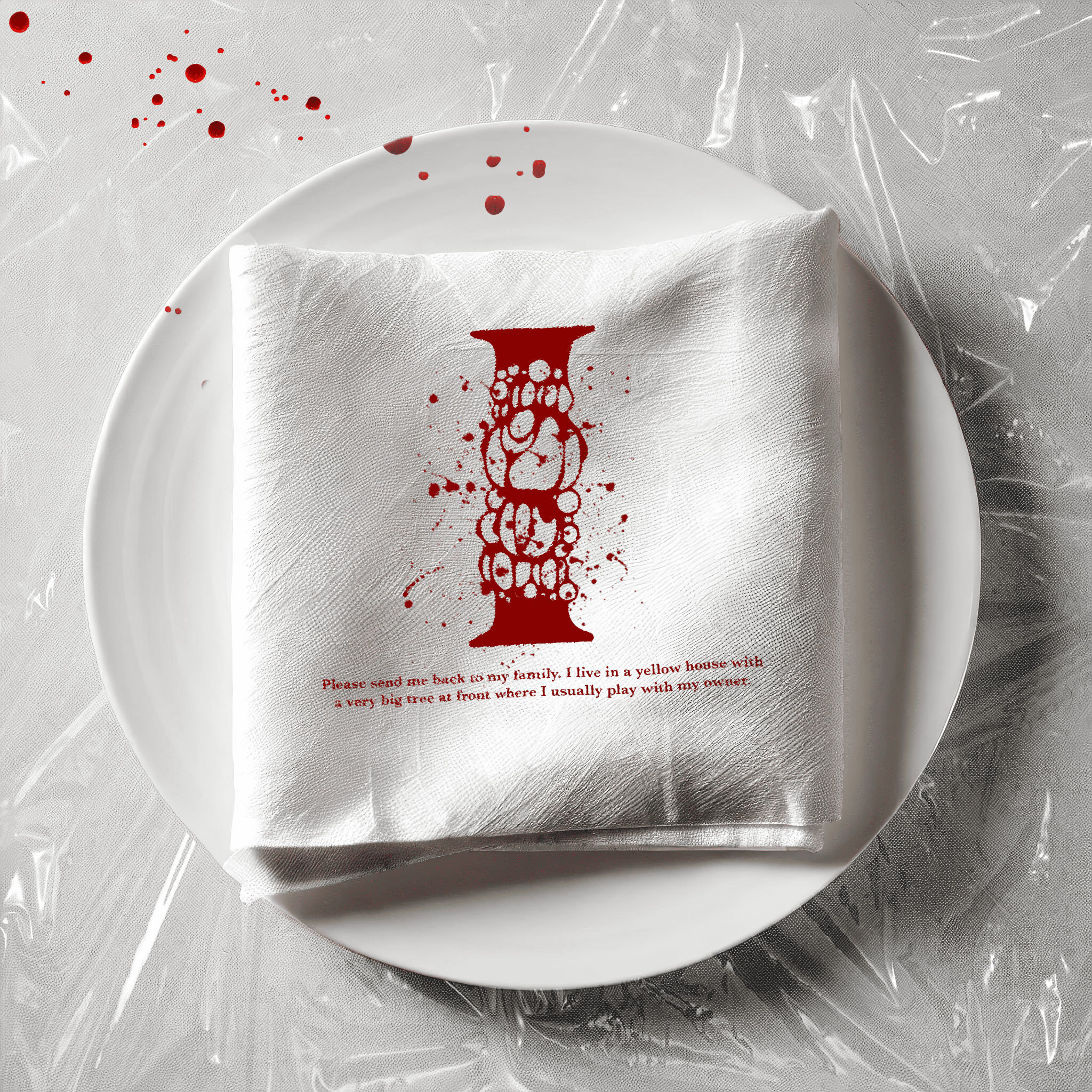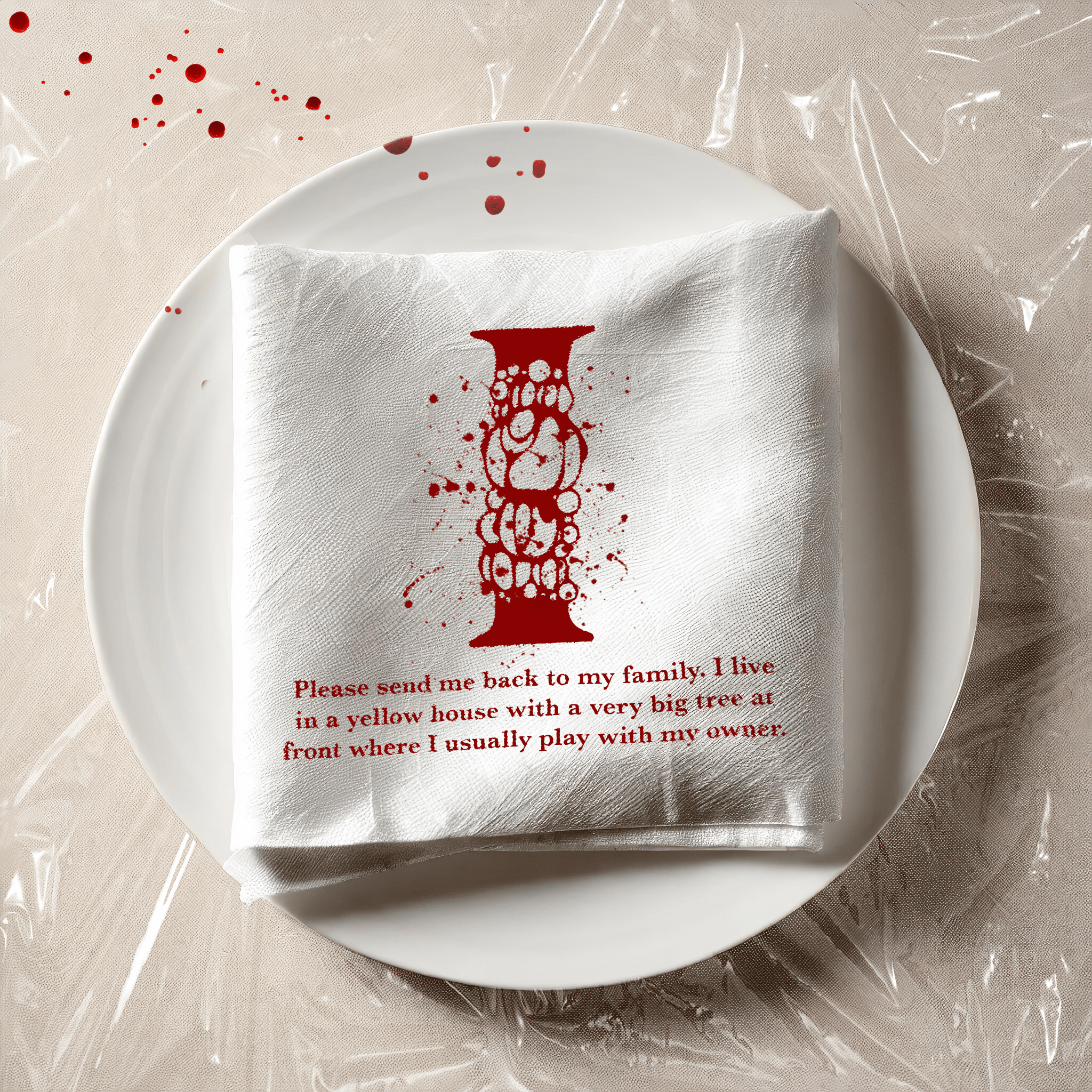
This project was born from a difficult time in my life. After losing my beloved dog, I found solace in creative expression. The initial concept was quite provocative – exploring the idea of animals as commodities, questioning whether they are seen as objects, food, or cherished members of our families.
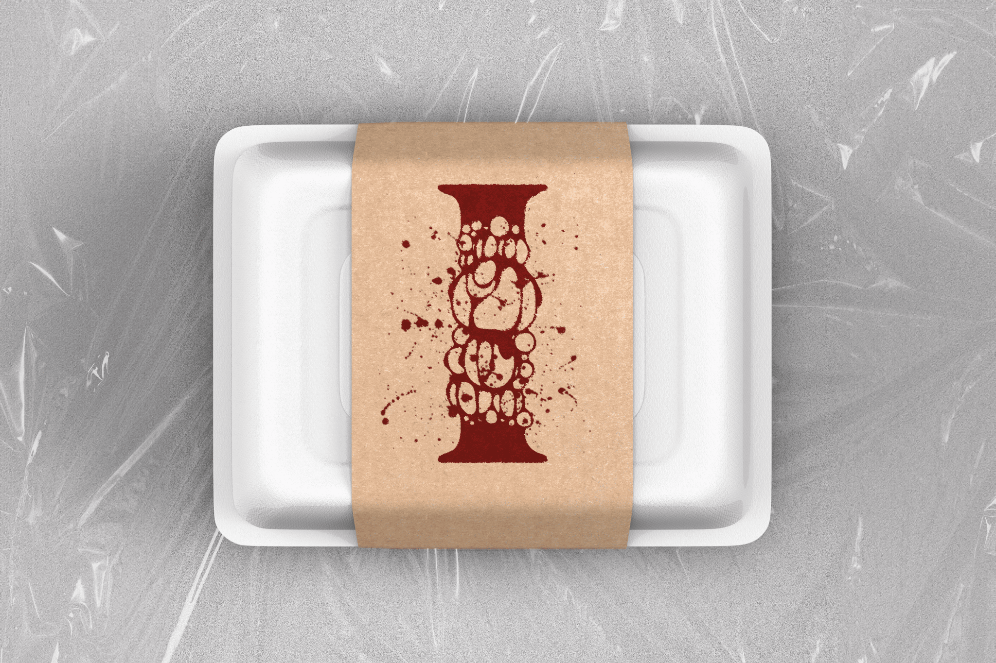
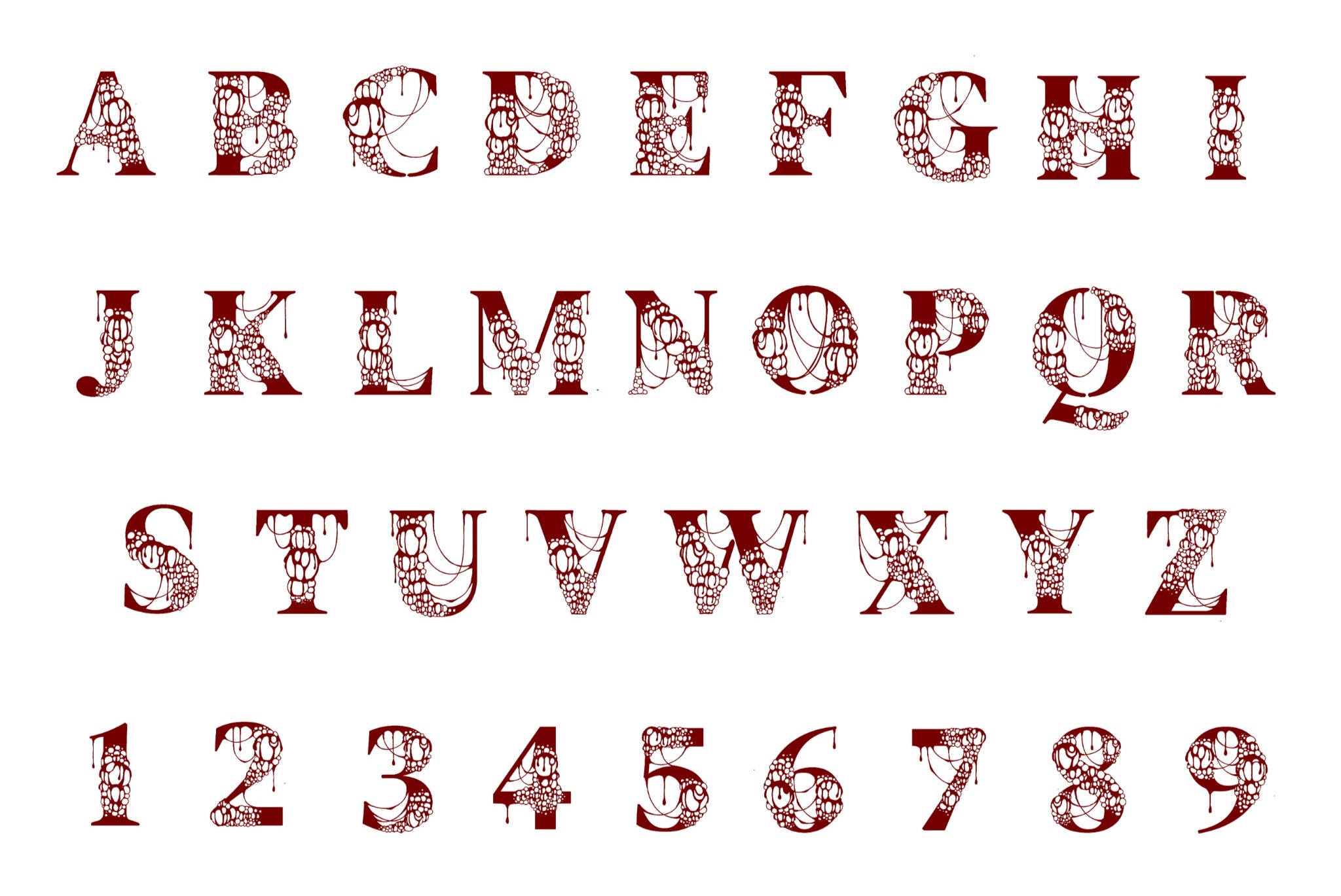
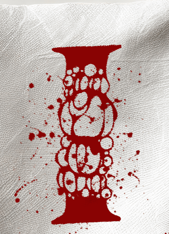
I'm fascinated by texture and motion in design. The "I" logo, with its textured appearance and the illusion of oozing liquid, really captured my imagination. This inspired me to complete the project by creating the entire alphabet in this style. However, the posters and concept packaging only feature the "I" as it reflects the initial focus of my exploration.
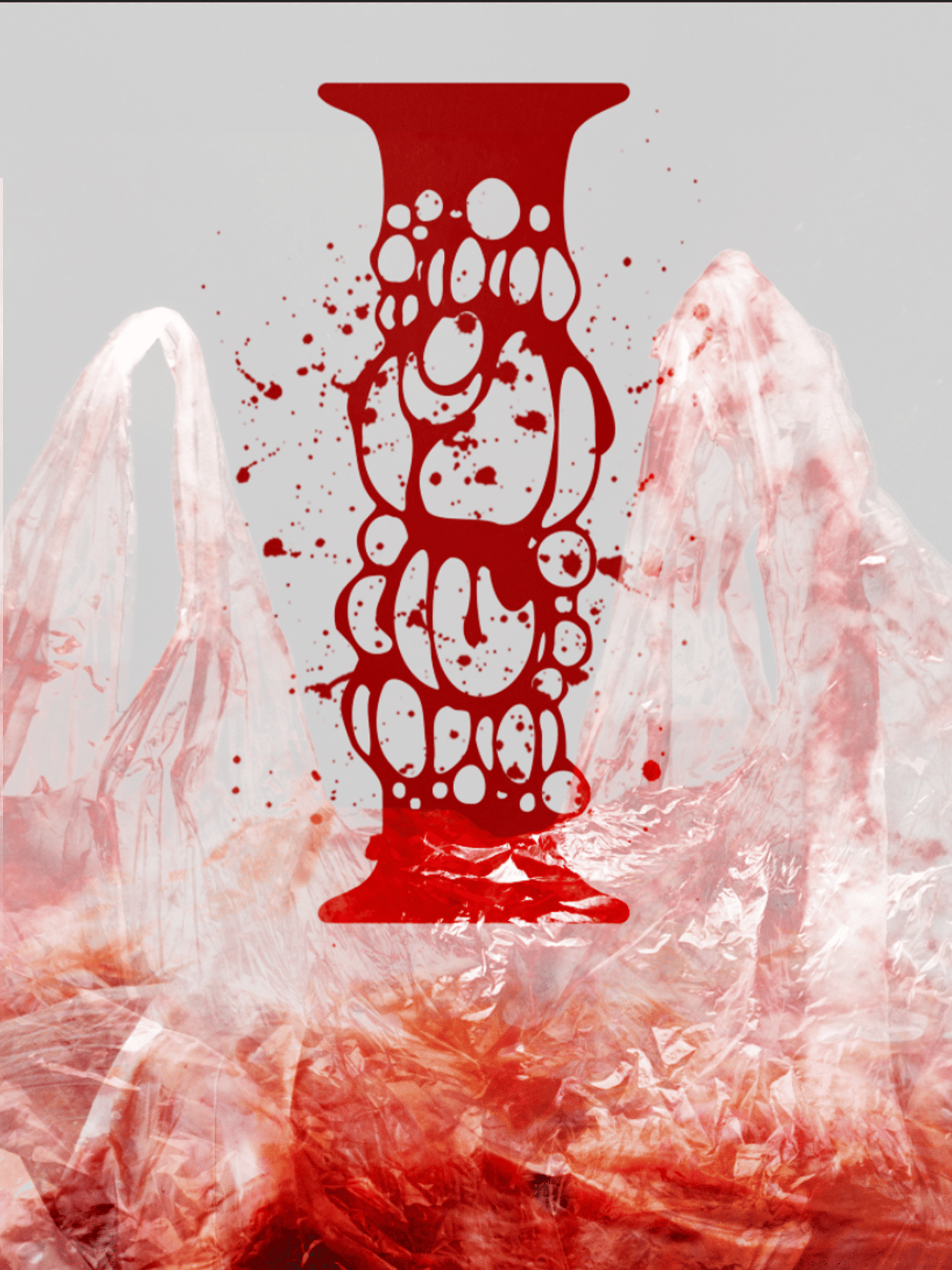
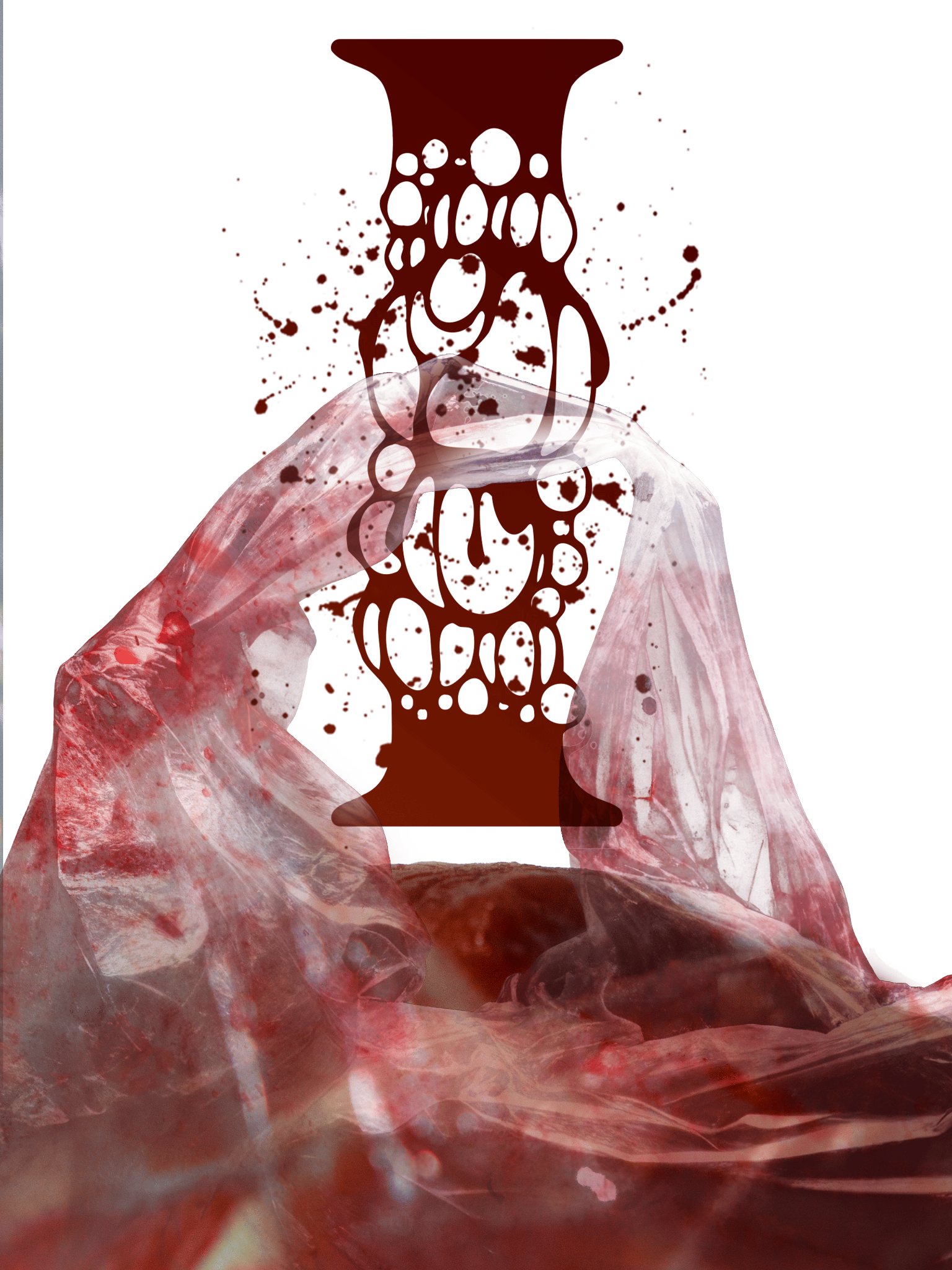
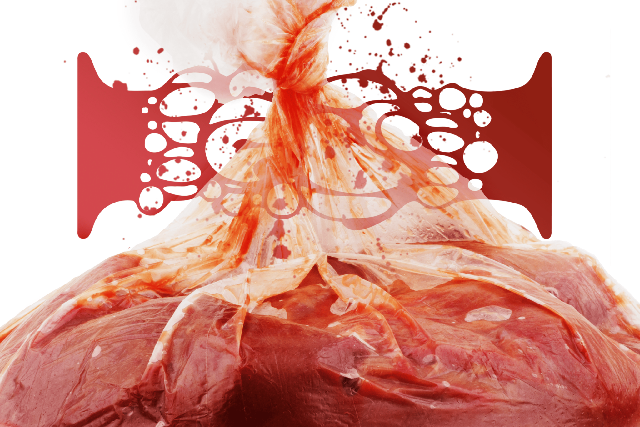
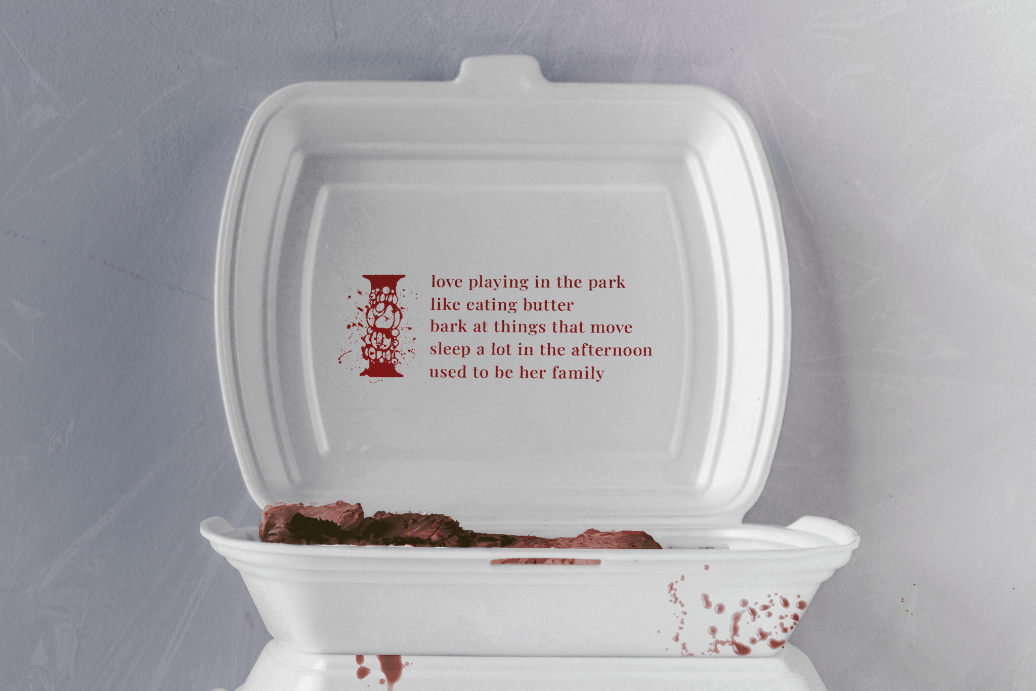
My initial idea was to use a strong, maybe even gory, visual element like a bloody piece of meat or an animal collar. But I realized this might overshadow the typography, which should be the main focus. It was still a fun experiment though, and I learned a lot about how visuals can impact how we read text.
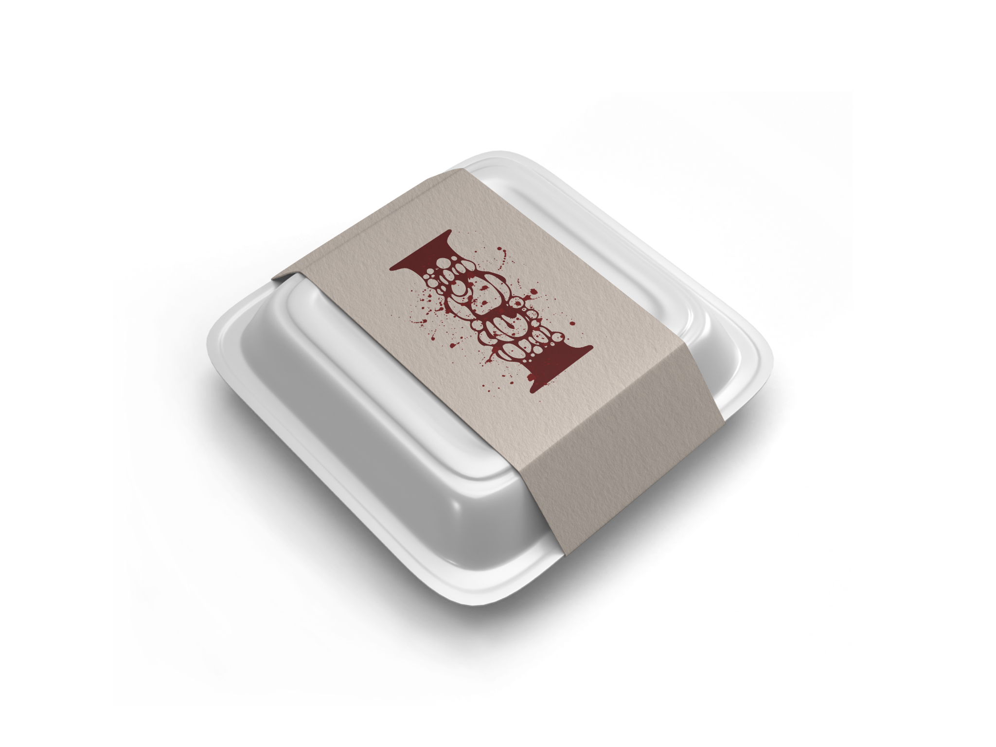
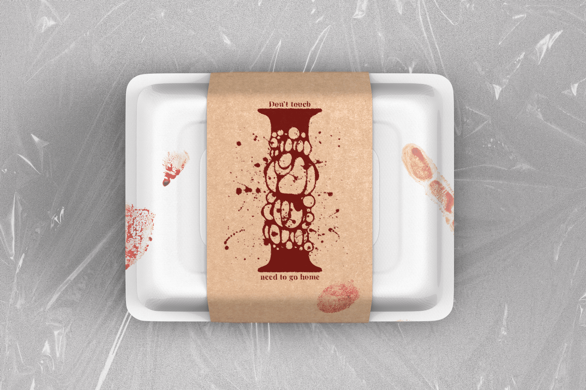
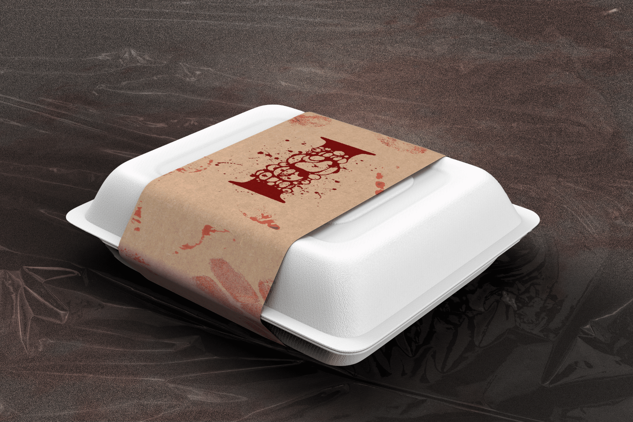
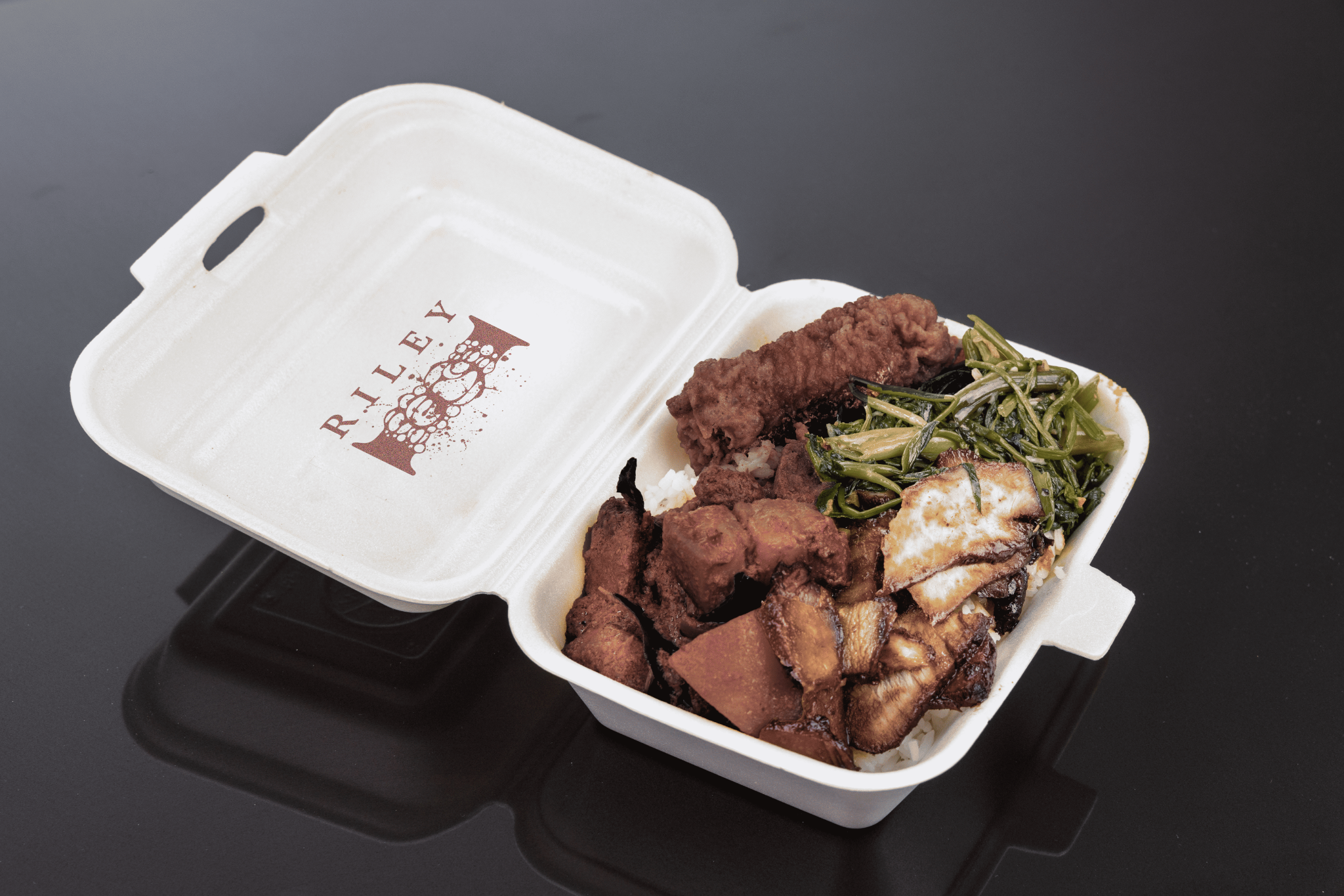
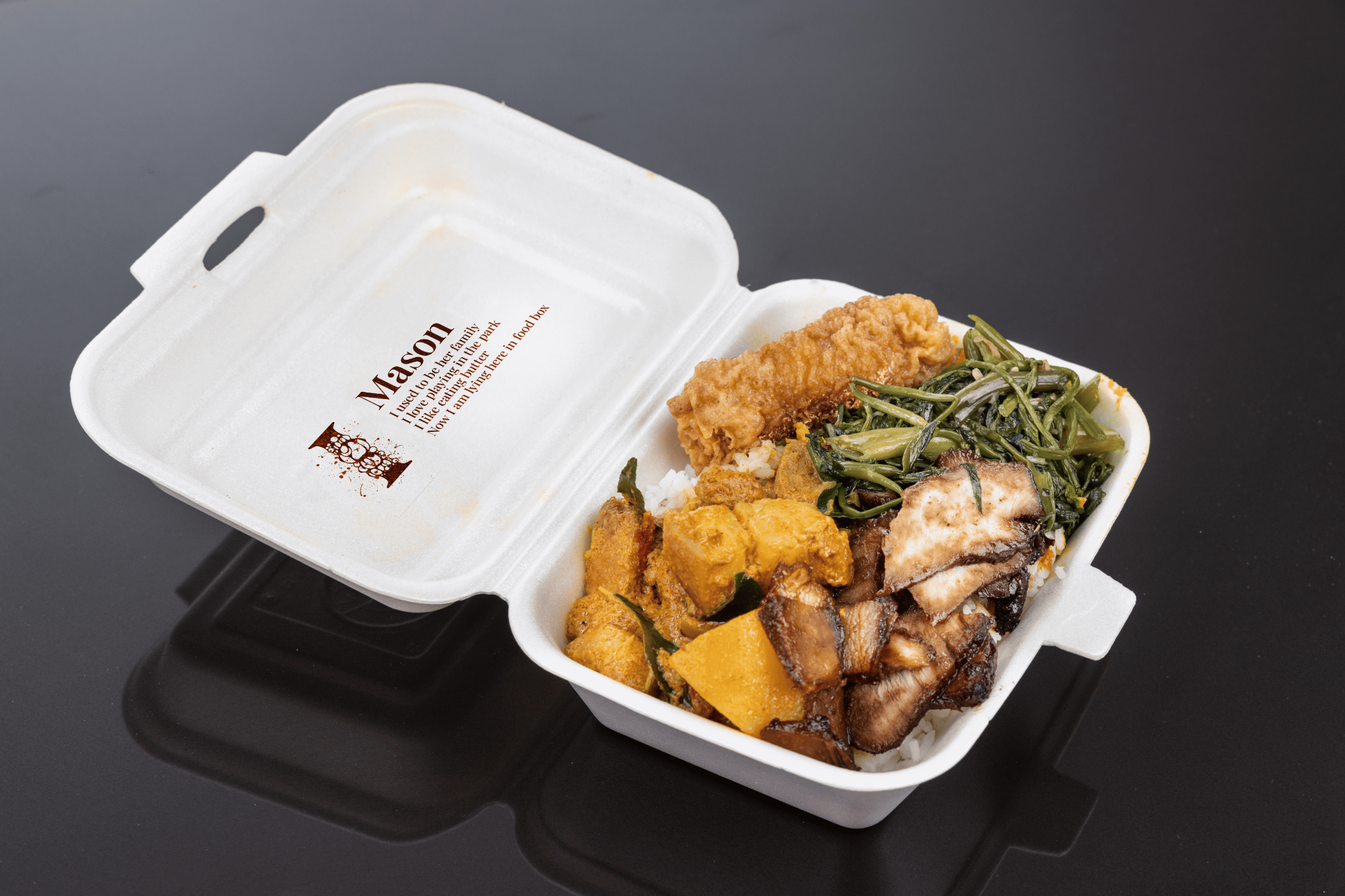
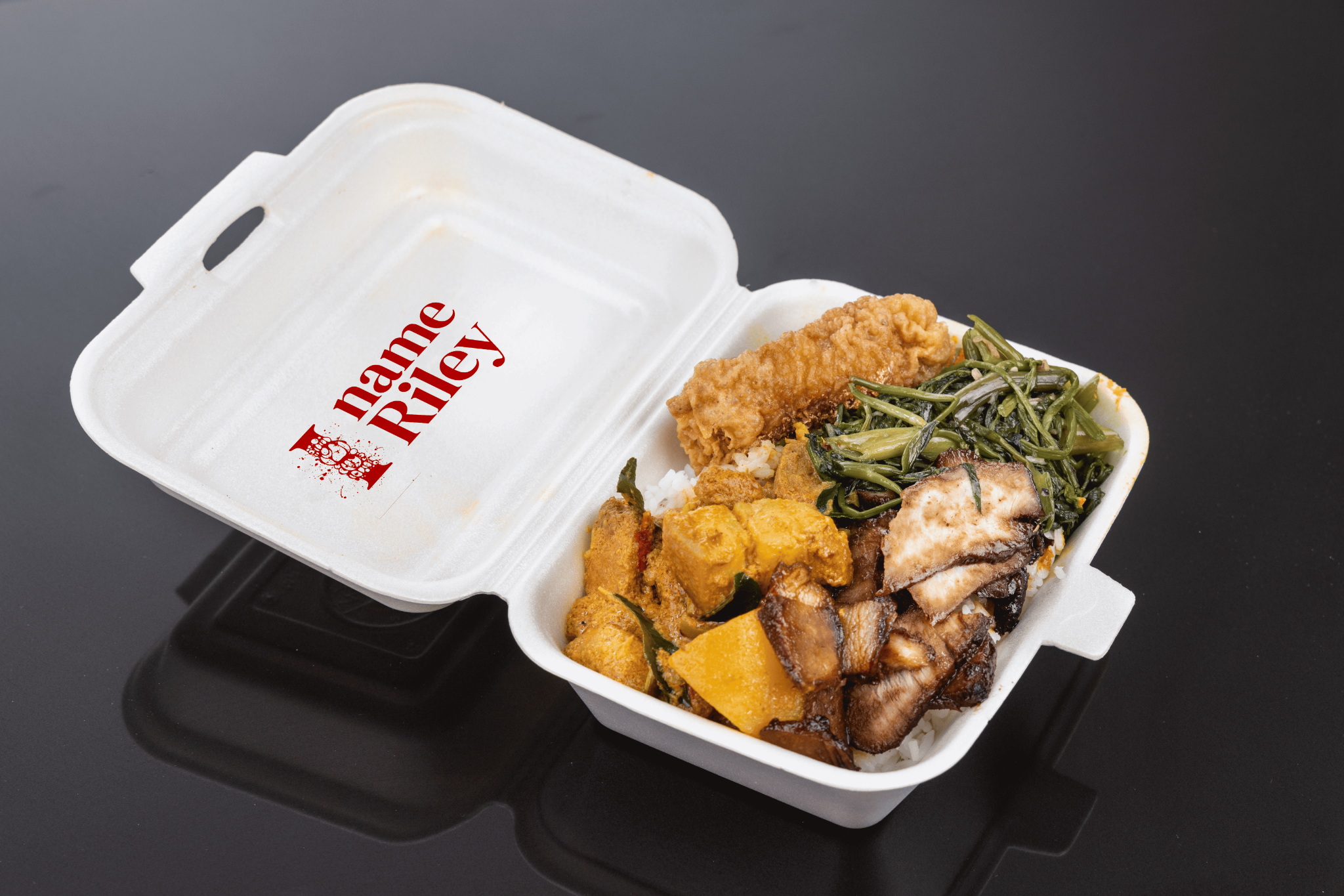
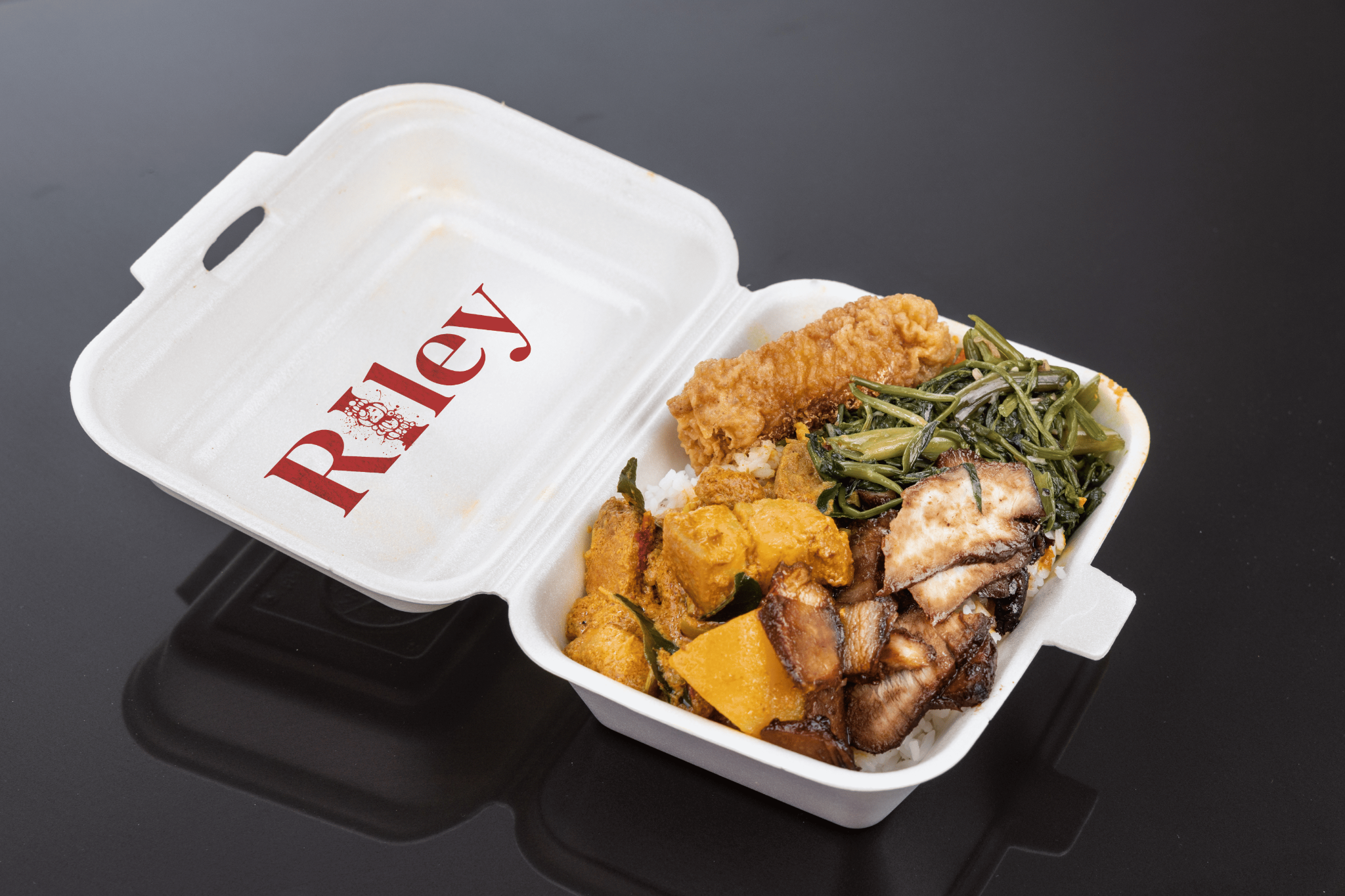
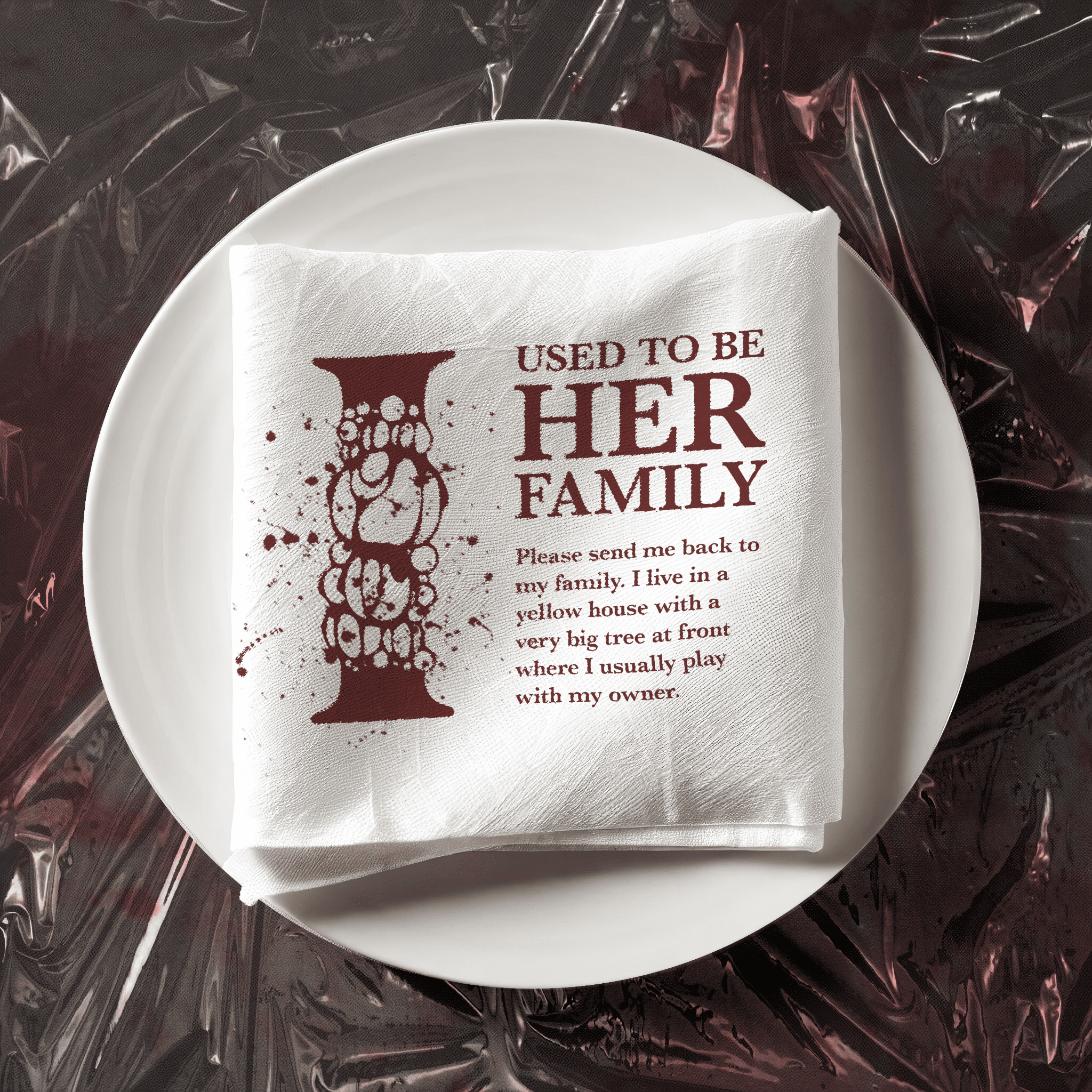
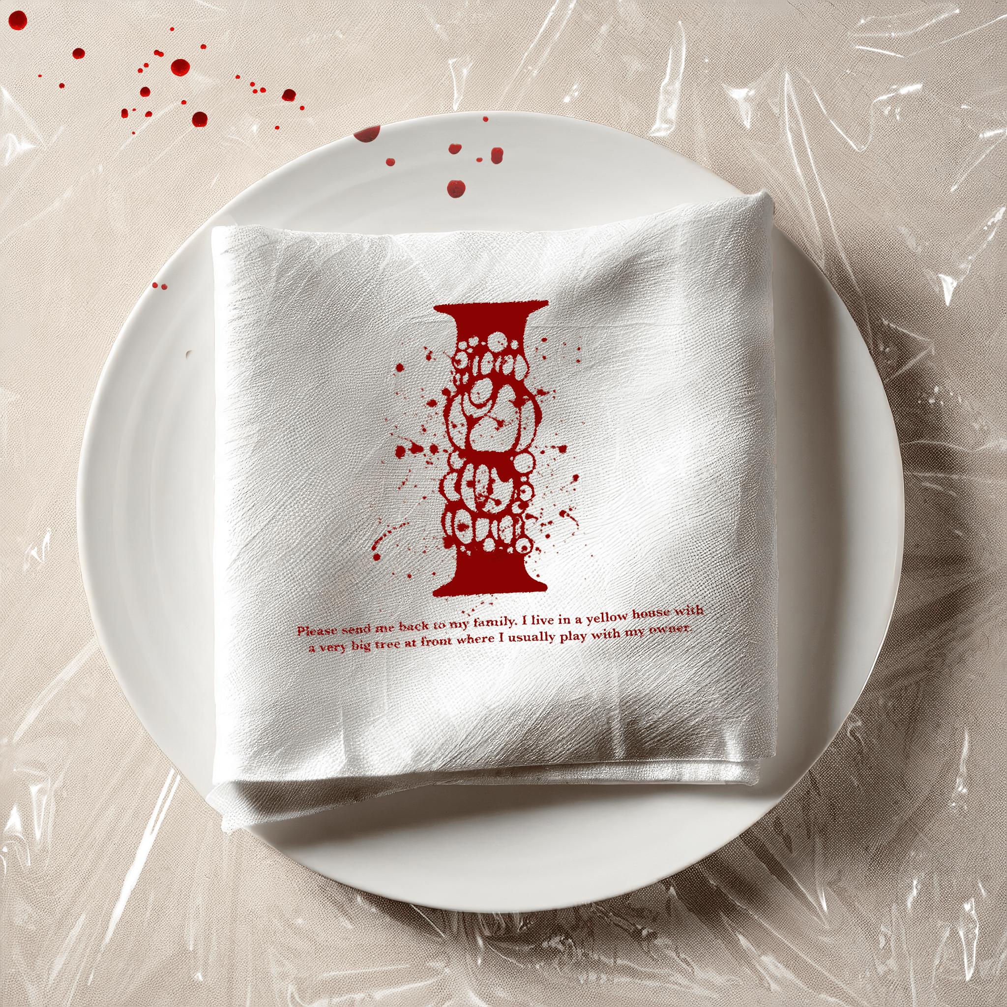
I often use those old food boxes with the brown wrapping paper. In Vietnam, they usually hold cheap street food. It makes me think about how these boxes might have once held someone's cherished pet, but now their identity is lost. This thought adds a bit of a provocative edge to the design. To emphasize this, I shifted the focus and toned down the bloody details, making the logo the centerpiece.
These experiments didn't quite work for a few reasons:
Many of these initial experiments presented some challenges. Some designs were overly complex, featuring too many visual elements that ultimately distracted the viewer from the central "I" logo. The abundance of visual noise made it difficult for the viewer to truly appreciate the logo's design.
On the other hand, some designs were overly simplistic, lacking the visual interest and impact necessary to effectively showcase the "I" logo. These designs felt somewhat bland and lacked the visual punch needed to truly stand out.